Storybook Process
This document outlines how the UI/UX and frontend team use Storybook as single source of truth to document common single components (e.g. action button group) as well as whole common page layouts (e.g. table view). Furthermore, Storybook acts as a documentation for design decisions and user flow decisions. This documentation should be considered as the glue between the UI/UX team and frontend team.
Please read the Storybook documentation to get an overview over the functionality and what's possible in general.
Currently, there is no live instance yet to access Storybook. To start it locally, just go inside the portal-frontend folder and execute pnpm storybook to spin up a local preview instance.
General workflow
When a designer wants to have information added to Storybook, he / she needs to write them in markdown beforehand. Afterwards, it needs to be implemented inside the codebase. Since we want to define clear areas of responsibility, we think designers should not be expected to work inside the codebase. Rather, they create a new ticket in our development board that describes what needs to be added to Storybook with their markdown content. A developer is then assigned to it and implements the new information. Basically, we then follow our standard implementation process like we do in every implementation (merge request, review).
Add information to Storybook
A developer can enrich the documentation (e.g. further design decisions, or adding new components/views ) in two scenarios:
- adding only raw markdown information
- documenting a component or view
Document raw information
Raw information (means just markdown text, no component stories) can be added by creating a new .mdx file inside portal-frontend/.storybook/stories with the following boilerplate content:
import { Meta } from '@storybook/addon-docs/blocks'

<Meta title="Getting Started/<your-page-name>“ />

# Your Title

...
Depending on the title property inside the <Meta> tag, the new page is created inside the navigation. For example, Getting Started is folder name and <your-page-name> the name of the new page.
Example
Let's say one would like to add a new page for defining font rules. He / she could add a new folder called Styling with a new page called Fonts. The .mdx file located inside portal-frontend/.storybook/stories/Fonts.mdx would look like this:
import { Meta } from '@storybook/addon-docs/blocks'

<Meta title="Styling/Fonts“ />

# Fonts

...
This is what Storybook renders:

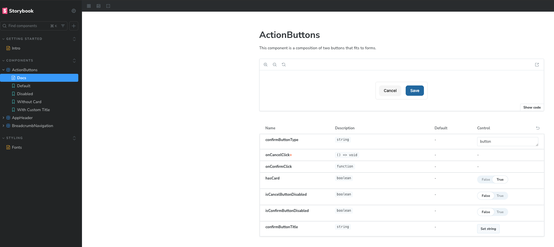
Document a new component / view
A view / page / layout story should be created when we've got two or more similar layouts. For instance, we've got several views that just display a table with filters. This is a perfect example for documenting a general table layout with all its characteristics. As soon as a designer realizes, that a page he / she designs follows a same layout that has already been implemented once, it's needed to put that layout into Storybook.
To document a new component / view for a component i.e. for components/action-buttons/ActionButtons.tsx, one needs to create a new file called ActionButtons.stories.ts on the same level as the component.
The story is then described with all the component's meta data. Based on that meta data, every shape of it that is relevant is described.
import type { Meta, StoryObj } from '@storybook/nextjs-vite'
import { fn } from 'storybook/test'

import { ActionButtons } from './ActionButtons'
import description from './ActionButtons.md?raw'

const meta: Meta = {
  title: 'Components/ActionButtons',
  component: ActionButtons,
  parameters: {
    layout: 'centered',
    docs: {
      description: {
        component: description,
      },
    },
  },
  args: {
    confirmButtonType: 'button',
    onCancelClick: fn(),
    onConfirmClick: fn(),
    hasCard: true,
    isCancelButtonDisabled: false,
    isConfirmButtonDisabled: false,
  },
} satisfies Meta<typeof ActionButtons>

export default meta

type Story = StoryObj<typeof meta>

export const Default: Story = {
  args: {},
}

export const Disabled: Story = {
  args: {
    isCancelButtonDisabled: true,
    isConfirmButtonDisabled: true,
  },
}

export const WithoutCard: Story = {
  args: {
    hasCard: false,
  },
}

export const WithCustomTitle: Story = {
  args: {
    confirmButtonType: 'button',
    confirmButtonTitle: 'Confirm',
  },
}
This is what Storybook renders: